Labradors and Friends Dog Rescue Group is a volunteer animal rescue group whose mission is to help save the lives of homeless Labradors, Labrador-mixes, and Labrador “friends” from kill-shelters in California and across the southwest. The organization needed to rebrand to stay competitive. The visual identity, mission statement, website, and copy were revised.
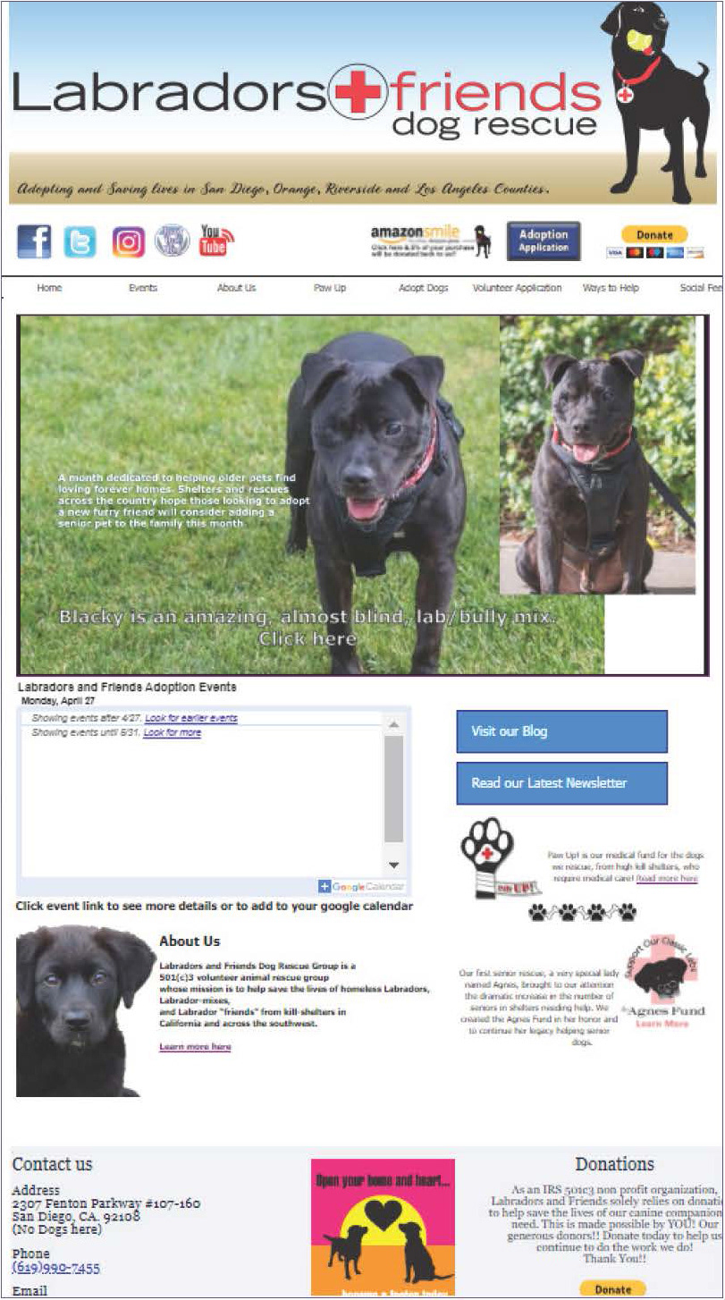
REBRANDED WEBSITE
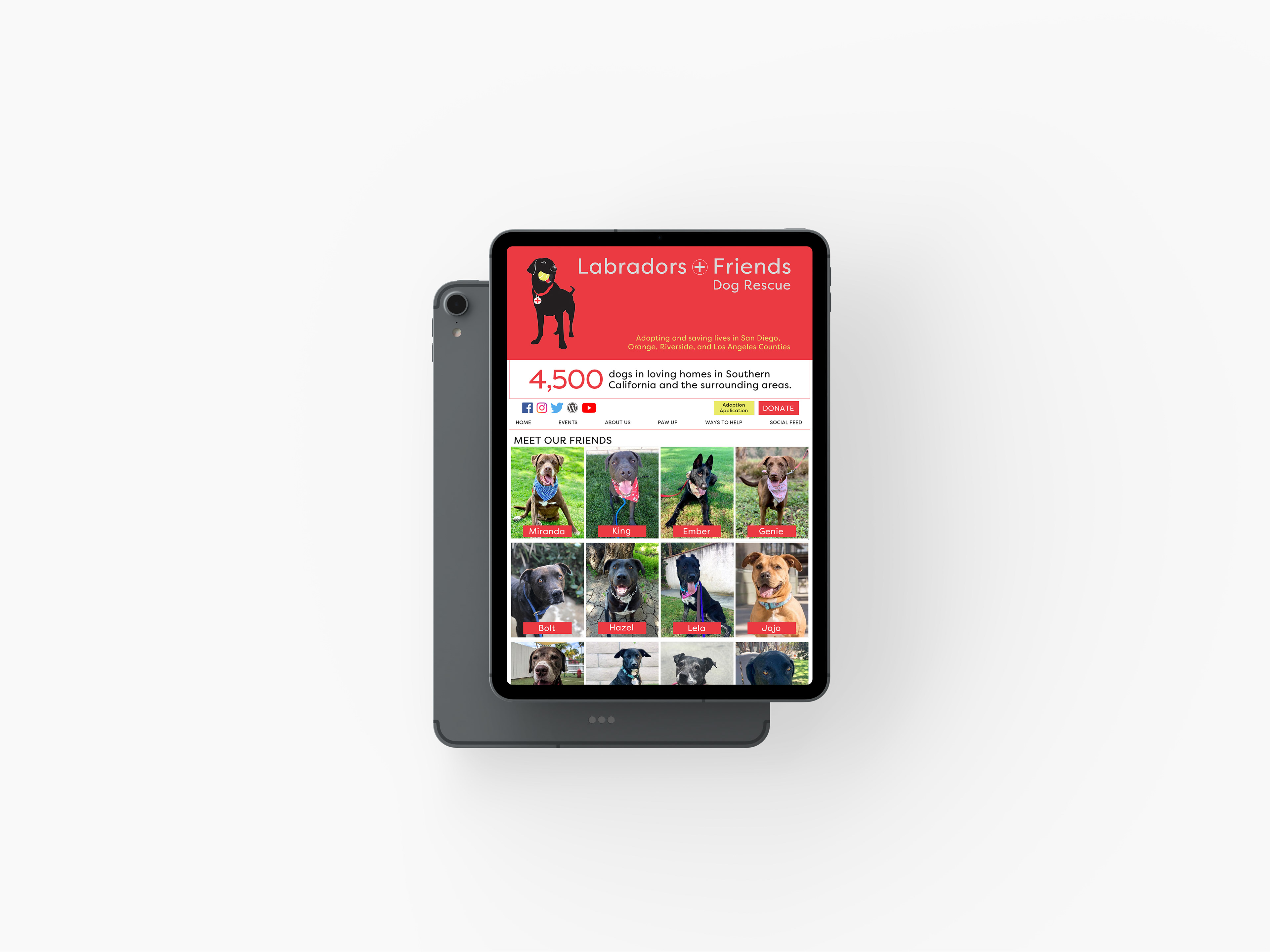
View of the landing page on a tablet
ABOUT US page with Mission Statement at top
Brand Differentiator- Why are Labradors + Friends different than the competitors?
What Makes Labradors + Friends Different From Other Rescues?
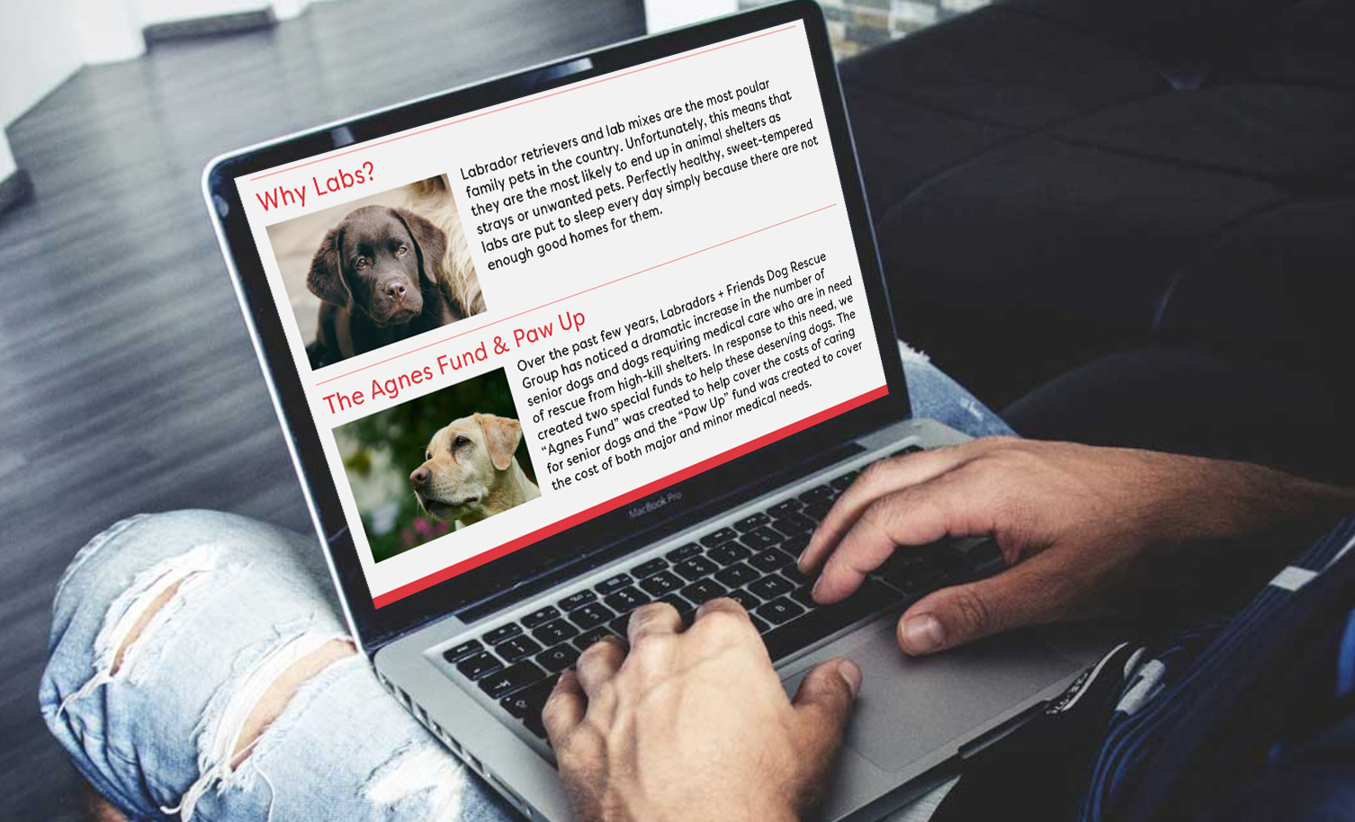
They are the only dog rescue that rescues LABRADORS, LAB-MIXES, AND FRIENDS from kill shelters. They also created the Agnes Fund to help cover the costs of caring for senior dogs and the Paw Up fund to cover the cost of both major and minor medical needs.
Who Is The Audience?
Someone that is specifically looking for a Labrador dog or someone that wants to rescue a dog versus buying from a breeder.
Why They Do It
Surprisingly, Labradors and Friends does not highlight how they stand out from their competitors. Why should we care about Labradors? Why should we give this organization money?
current identity
LOGOMARK, VISUALS, TONE
The website landing page is outdated, has confusing navigation, and uses graphics that are not formatted for the image carousel. The carousel doesn't fully work and displays a black screen. There is no style guide in place throughout any of the platforms.
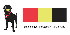
The Logo
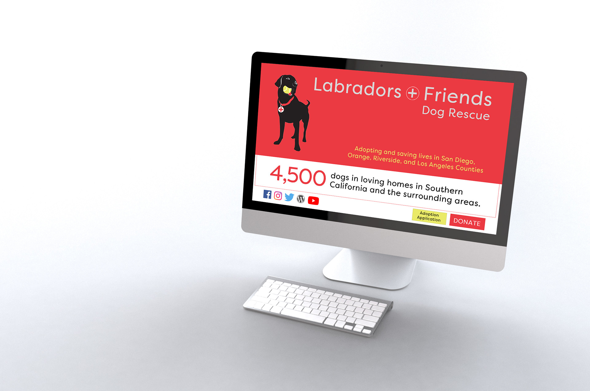
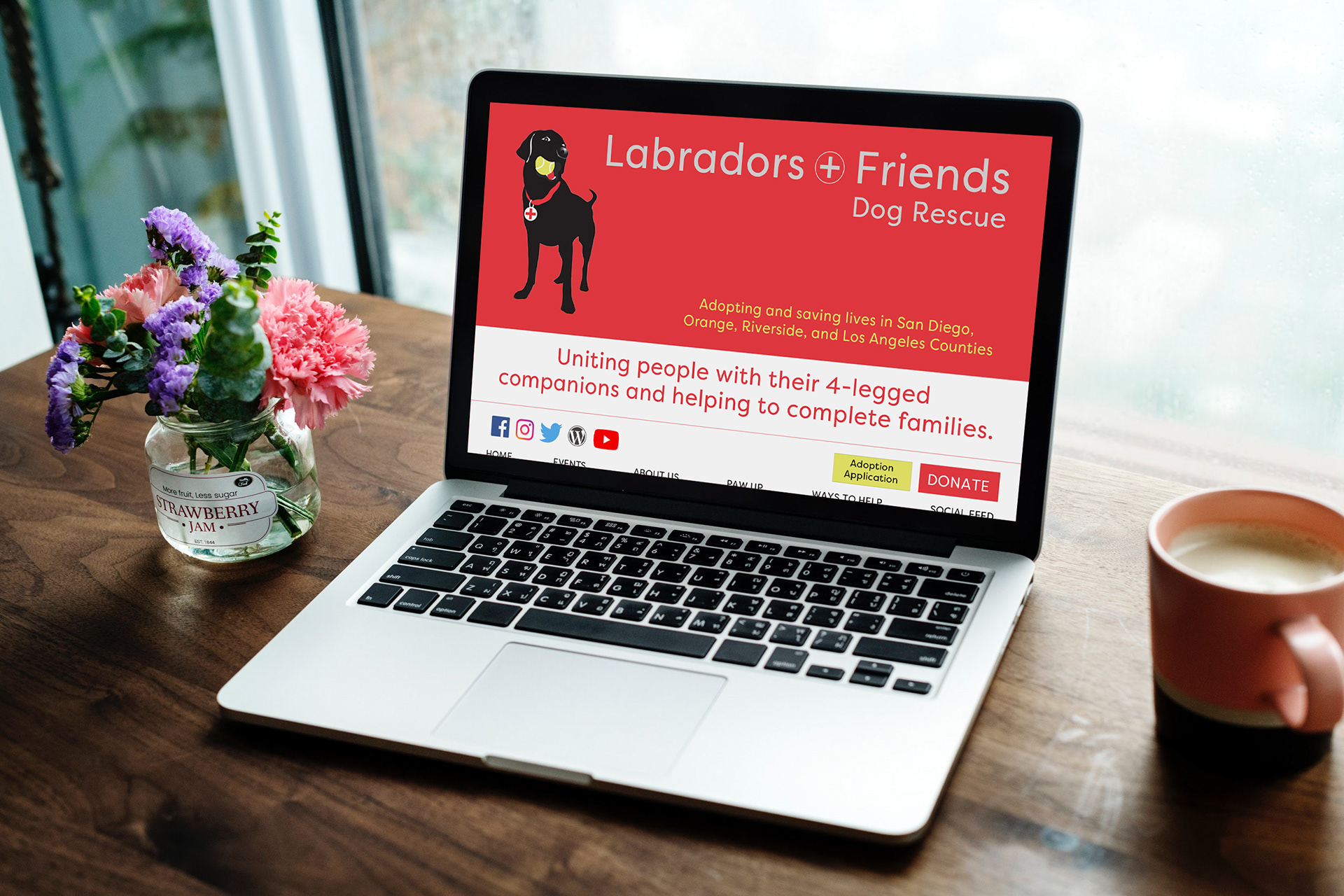
The current black Labrador icon with a tennis ball is unique in its industry. I decided to keep the icon and create new branding colors based on the Labrador.
REVISED MISSION STATEMENT
After reading all the copy and researching the competition, the mission statement was defined. Labradors + Friends was the only organization that specifically said that Labs "completed families." I decided to make that a central part of their statement and place it at the top of the ABOUT US page.
COLD

Uniting people with their 4-legged companions and helping to complete families.
identity rebrand
LOGOMARK, VISUALS, TONE
Bright colors set a modern, friendly tone for the website landing page. The dogs available for adoption are now easily found and the interface has an energetic tone.
